Friday, January 3, 2014

Perspective of The Ringling Musuem in Sarasota Florida


I vacationed in Sarasota Florida and I went to The Ringling Museum 
I was inspired by the amazing perspective in the portico outside. 
This is the finished project. 
These are some of the other
 pictures I took around the museum

     This drawing is a 1 point perspective. I chose to do this solution because the architecture is amazing and the coloring is beautiful and different from anything I had seen before. I had never worked with multiple colored pencils and mixing colored pencils before so that was a big risk for me. I enjoyed getting the perspective down but I did not enjoy coloring it in with colored pencils. Next time I do a work with colored pencils I will keep it simple. 

Monday, December 2, 2013

The colorful skeleton: layering

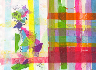
     Some of my ideas for this layering project was to layer shapes and tissue paper, a collage or layers of acrylic paint and layering many spray painted stencils, layering organic material like leaves, layering coins, painting silhoetts on a canvas, layers of ink from stamps, layers of pictures of noses. I decided on drawing a skeleton and transferring the color of  tissue paper on it.
I drew this skeleton first with pencil and then with a fine tip sharpie.
     Then I cut the tissue paper into strips and layed them individually down on the paper. I made a mixture of water and glue and brushed this mixture over the strips on the peice of paper. Then I took the stips off and the color or the tissue paper was left.
      Next I painted the skeleton with white paint making sure the skeleton was still transparent.
     By doing all of the different layers of tissue paper color I lost the skeleton so I went over the skeleton with a thicker sharpie. I contemplated for a long time doing something else with this piece. I wanted to add some 'drips' using a mixture of elmers glue and acrylic paint. I realized that this wouldn't add anything substantial so I left it. But I added my signature in the bottom right corner with this mixture.

    I used no specific pattern or technique for layering the tissue paper. By this I am saying no matter what kind of 'layers' we have on, in the end aren't we all skeletons?
Just something to think about :)


Friday, October 25, 2013

Time as an Element: Party till you drop

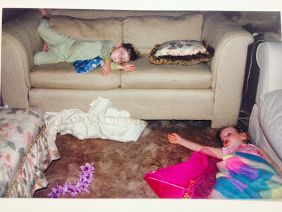
ORIGINAL PICTURE
RECREATED PICTURE


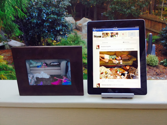
The facebook post says "Crazy party at the Guenther's last night"


    Some of my ideas for Time as an Element was to make a time machine, take pictures of places I went during my day, and to recreate a picture. 
     I chose to recreate a picture of my sister and I  from  when we were little. This concept has been done over and over so I wanted to make it original by having similar posing with the same people (grown up of course), but I also wanted to modernize it. 
    I demonstrated Time in my work by the use of photography capturing the same people in the same poses yet the photos look very different because the scenery and people changed over time. 
    
    I chose to use photography as my medium because it could most accurately portray the recreated photo.  By using photography I could download the modern picture to facebook.

     I used photography and photoshop in this project. I first I took the recreated picture of Gabby and I and I made sure it was as close to the first picture as I wanted. Then to display the two pictures the way they would have been displayed in their time period I did the following: 

-original picture: Put it in an old picture frame (how pictures used to be displayed)
-recreated picture: downloaded it to Facebook and displayed it on my iPad. (how pictures are now displayed)
    
     The concept of this project is to show how photogpraphs used to be shared and how that has changed drastically over time. Photographs used to always be physical but usually now they dont even get printed they are displayed over Facebook, Instagram, Pinterest, Tumblr and many more photo sharing sites. In the future will we not have picture frames around our house at all?


Wednesday, October 9, 2013

Intertextuality:Crossing the yellow brick road


  Some of my ideas while making this piece was: Rondald Mcdonald on a scale eating veggies, a can of beans with the Chicago Bean in it, and Mickey mouse with a gun. I chose to do a cross walk sign with Dorothy and The Tin Man. By just adding a few small images to the cross walk sign (the ruby shoes, Tin Man's heart, Tin hat, and the yellow bricks) I changed the message of the cross walk sign. It went from a regular cross walk sign's meaning: to watch out for pedestrians crossing the street, to a different kind of cross walk sign's meaning: to watch out for the characters of The Wizard of Oz when they cross the Yellow brick road
  
  I used a wood board and cut it into the shape of a cross walk sign. I painted this board yellow with yellow enamel to make it have a shiny finish like a normal cross walk sign. For the crosswalk people I made a stencil and spray painted them black. I used a stencil technique for this piece. For this technique I had to use sticks to hold down the part of the stencil that I was spray painting to make sure there were no fuzzy lines. 

   The risk I took was I spent so much time making my cross walk sign accurate before I spray painted the Dorothy shoes and Tin hat on it so taking that step was a big risk in case I made a mistake on the sign and had to start over. I used technique with the accurate cross walk sign and stencil making and spray painting. I also used concept in my piece from turning it from one message to a completely different meaning with the use just a few small images. 

Wednesday, September 11, 2013

Art 3

This is not the project that was assigned, just was messin around with some water color and this came out of it.

Tuesday, January 10, 2012

Really bad Photoshop!

If you couldn't tell already, the panda is photoshoped into the picture ;) (I did this with no photoshop experience so its ok its bad right?)

Wednesday, December 21, 2011

LANSCAPE PAINTING !!:)


Finished my lanscape painting! First I painted my canvas totally orange. Then I painted the blue sky all the way down along with the clouds. Then I did the dark trees, afterwards going in with the highlighting of the trees and reflecting of the water. I am giving this to my mother for Christmas:) !!!

Friday, December 9, 2011

My Clay pot!

For this clay pot I first the clay through a slab roller, flattening the clay out. After that I molded it over an upsidown bowl, smothing it out as I did this. Then I carved in a design and traced it in red clay. Then once I was done with the design it was put in the kiln to dry. In this picture it shows me glazing the pot, after this it will be put in the pot and become glossy. I am giving this pot to my dad for Christmas:) (if you were wondering [which you weren't])

Still life

This still life was a little dificult for me. Its hard to draw glass because you really have to look at the highlights and the colors shining through it. Also for the flowers and the vase, I originally had it looking more light, but it was hard to tell the depth of it. After darkening the shadows it looked more realistic. I decided not to color in the background but after this picture was taken I made a corner more light, adding a highlight and shadows. I also added a table under the still life display. I am giving this picture to my mom for Christmas:) (incase you were wondering)

Wednesday, October 26, 2011

Panda Stencil! 2011

First I traced out the black making sure the white spaces had no islands. After this I cut out all of the black spaces. I also made a '22 by '26 frame.

Once I was done with cutting out all of the black spaces I spray painted on top of the stencil to create the picture.
finished product of the panda stencil